Retro colors have made a vibrant return to interior design, offering a nostalgic yet modern way to add character and charm to any space. By blending vintage hues with contemporary aesthetics, you can create a unique, dynamic environment that pays homage to the past while feeling fresh and current. Whether you’re drawn to the bold tones of the 1970s or the muted palettes of mid-century modern design, these innovative retro color ideas will help you transform your home.
1. Mustard Yellow and Burnt Orange
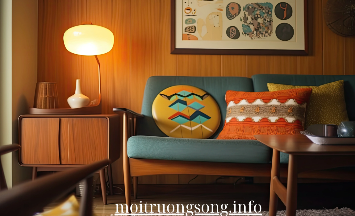
Few color combinations evoke the 1970s like mustard yellow and burnt orange. These warm, earthy tones create an inviting and energetic atmosphere that works well in both small accents and bold statements.
- How to Use: Pair mustard yellow or burnt orange with neutral tones like cream, tan, or brown to balance out the intensity. Try a burnt orange accent wall or incorporate mustard yellow through throw pillows, rugs, or kitchen accessories for a retro pop of color.
- Why It Works: These bold hues are perfect for adding warmth and vibrancy to any space. When used in moderation, they can give your home a retro flair without overwhelming the room.
2. Olive Green and Avocado
Olive green and avocado were iconic colors of the mid-century era, particularly in kitchens and living spaces. These rich, natural shades offer a grounding element to any room, bringing a sense of calm and connection to nature.
- How to Use: Olive green works beautifully as a backdrop for wood furniture, while avocado can be introduced through textiles like curtains, cushions, or upholstered chairs. Pair these shades with dark wood, brass accents, and deep greens for a modern take on mid-century style.
- Why It Works: Olive and avocado bring a natural, earthy vibe to interiors, making them ideal for creating a relaxed, retro-inspired space. These colors also complement other retro tones like mustard or teal, making them versatile additions to any design.
3. Teal and Turquoise
The lively hues of teal and turquoise were popular in the 1950s and ‘60s, lending a bright, playful feel to retro kitchens, bathrooms, and living rooms. Today, these shades can be used to inject energy and color into modern interiors.
- How to Use: Teal or turquoise can make a bold statement on a kitchen backsplash, an accent wall, or through cabinetry. To keep the look fresh, pair these colors with white, chrome, or matte black finishes. For a more subdued retro look, try adding teal through smaller accents like artwork, throw pillows, or light fixtures.
- Why It Works: These cool, vibrant colors add a refreshing, upbeat vibe to any space. Teal and turquoise are versatile enough to be used in modern minimalist designs or as part of a vintage-inspired scheme.
4. Soft Pinks and Blush Tones
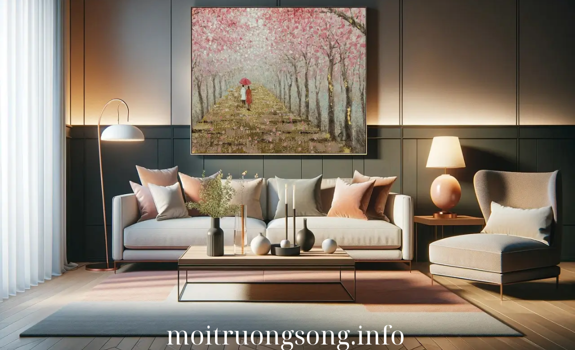
Retro design often includes soft pinks and blush tones, particularly in bathrooms and bedrooms. These pastel shades, popular in the 1950s and ‘60s, bring a subtle, feminine touch to any space.
- How to Use: Use blush pink as a feature wall in a bedroom or as a soft accent in living rooms through cushions, rugs, or artwork. Pair pink with gold or brass accents and neutral tones like grey or white to keep the look contemporary and sophisticated.
- Why It Works: Soft pinks create a calming, cozy atmosphere while still adding a hint of retro flair. They work especially well in bedrooms, bathrooms, or any space where you want a light and serene ambiance.
5. Bright Red and Chrome
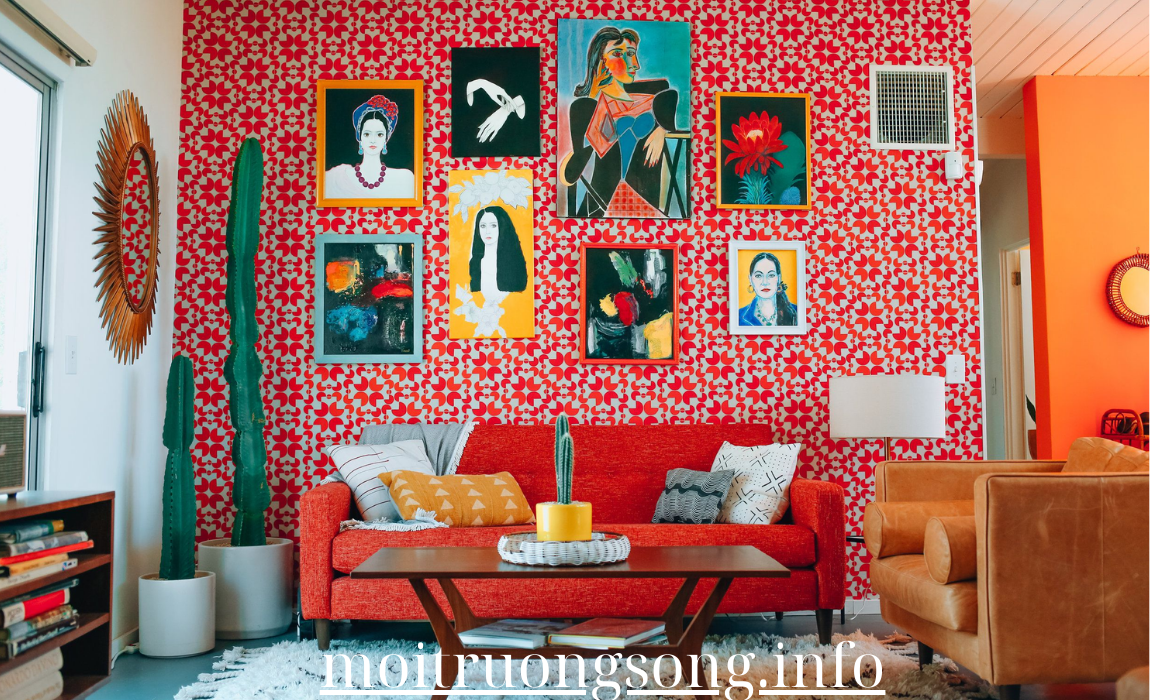
Nothing says retro quite like bright red and chrome, a hallmark of 1950s diner style. This combination brings a fun, energetic vibe to kitchens, dining areas, or even home offices.
- How to Use: Incorporate bright red through kitchen appliances, barstools, or diner-style booths. Chrome accents, like faucets, light fixtures, or retro-inspired bar carts, complement red for a polished, vintage look. To tone it down, use red as an accent rather than a dominant color in the room.
- Why It Works: The combination of bright red and chrome creates a nostalgic yet dynamic feel, perfect for those who want to make a bold statement. These colors work particularly well in kitchens or entertainment spaces where energy and vibrancy are key.
6. Powder Blue and Soft Grey
Inspired by mid-century modern design, powder blue and soft grey offer a sophisticated retro look that is both calm and refreshing. This combination is ideal for homeowners who want a subtle nod to the past while keeping things light and contemporary.
- How to Use: Powder blue can be used on walls or cabinetry, while soft grey provides a neutral balance through furniture or flooring. This combination works well in bedrooms, bathrooms, or living areas, especially when paired with light wood furniture and minimalist decor.
- Why It Works: Powder blue and soft grey create a peaceful, harmonious environment, perfect for those looking to blend retro aesthetics with modern simplicity. These colors also pair well with other pastels or muted tones for a layered, elegant look.
7. Peach and Coral
The soft, warm hues of peach and coral were staples of retro design in the 1960s and ‘70s. These colors add a cheerful, warm ambiance to interiors and can be used in a variety of ways to bring a retro feel into modern spaces.
- How to Use: Use peach or coral as an accent wall in living rooms, entryways, or bedrooms. These colors also work well in textiles, such as bed linens, curtains, or decorative cushions. Pair them with natural wood and white for a breezy, modern look.
- Why It Works: Peach and coral are warm and inviting colors that bring a sense of playfulness to a room. Their versatility makes them ideal for creating a light, uplifting atmosphere that’s still rooted in retro charm.
8. Burgundy and Mustard
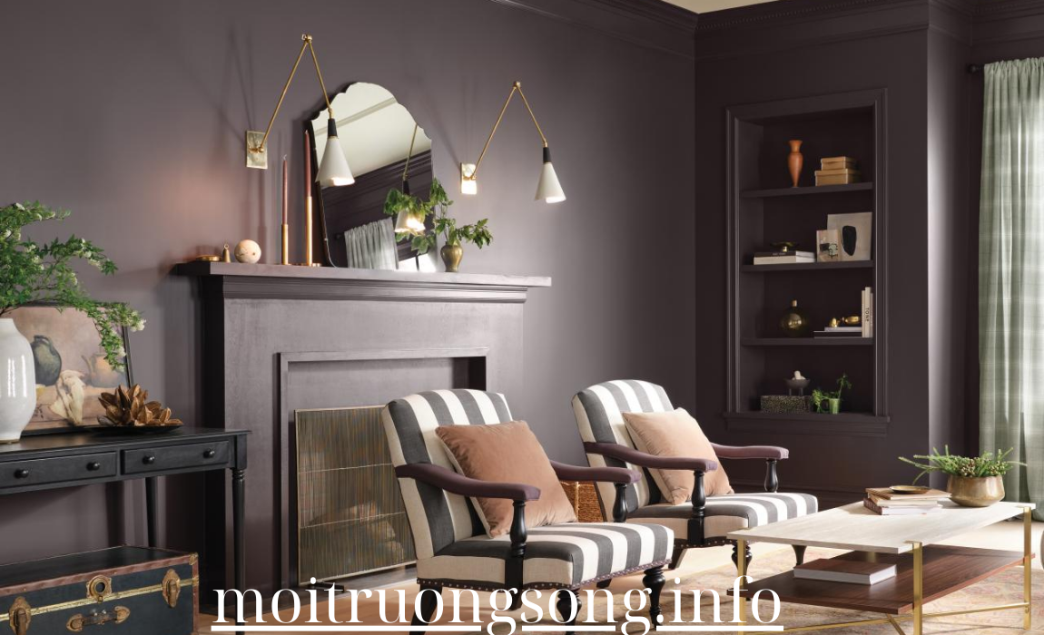
For a more dramatic take on retro color schemes, try burgundy and mustard. This rich, bold pairing adds a sense of depth and luxury to interiors, reminiscent of the velvet and leather textures often used in the 1970s.
- How to Use: Burgundy works well in living rooms or dining areas, where it can add a touch of formality and richness. Use mustard in accent furniture or decor, like throw blankets, chairs, or lamps. Pair these bold colors with neutral backdrops or metallic accents to keep the space balanced.
- Why It Works: Burgundy and mustard bring a dramatic, retro vibe to interiors, perfect for those looking to create a luxurious, moody environment. These colors are bold but can be balanced with natural or neutral tones to prevent the space from feeling too heavy.
Final Thoughts
Retro color palettes are making a comeback, and their versatility allows you to integrate them into any modern interior. From bold, statement-making hues like mustard yellow and burnt orange to softer tones like powder blue and blush pink, these innovative retro color ideas can transform your home with a perfect balance of past and present. Whether you’re going for full-on vintage vibes or just a hint of nostalgia, these color trends will bring character, style, and warmth into your living spaces.


