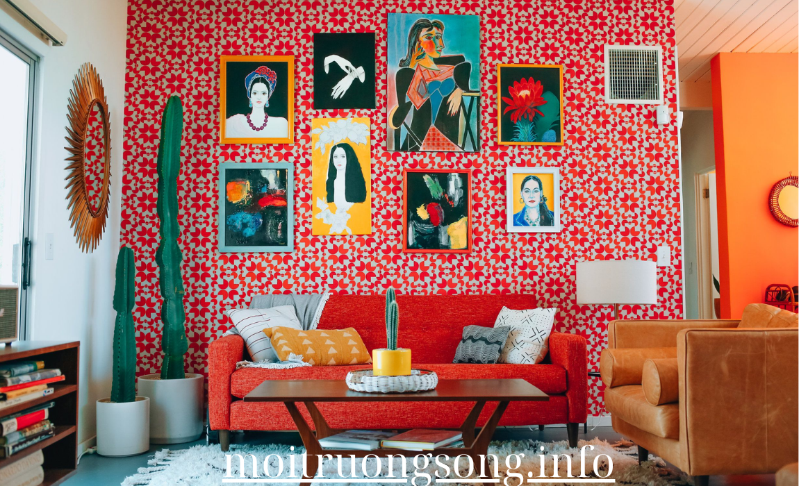
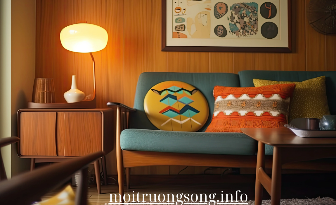
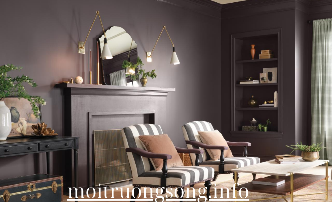
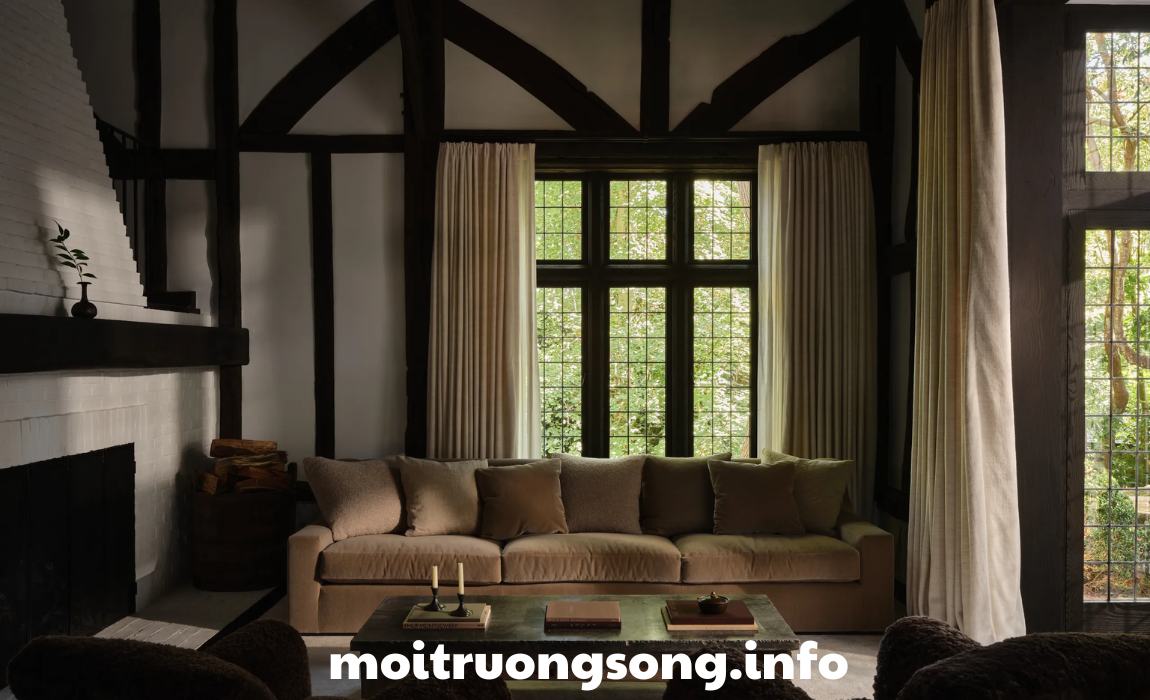
Revamping your space with retro color palettes can bring a vibrant and nostalgic vibe to your home. Whether you love the bold hues of the 1960s or the muted tones of the 1970s, retro colors can create a unique and stylish atmosphere. Here are some popular retro color palettes, along with tips on how to incorporate them into your home design.
1. 1960s Mod Colors
The 1960s introduced a playful and bold color palette characterized by bright and saturated hues.
- Key Colors: Electric blue, hot pink, lime green, and sunny yellow.
- How to Use:
- Accent Walls: Choose one bold color for an accent wall, such as lime green or electric blue, to create a striking focal point.
- Furnishings: Incorporate colorful furniture pieces, such as a hot pink sofa or bright yellow chairs, to enhance the playful vibe.
2. 1970s Earth Tones
The 1970s embraced earthy hues that evoked a sense of warmth and comfort.
- Key Colors: Burnt orange, olive green, mustard yellow, and rich browns.
- How to Use:
- Layering: Combine different earth tones in textiles, such as curtains, rugs, and cushions, to create a cozy and inviting atmosphere.
- Accent Pieces: Use statement furniture or artwork in burnt orange or olive green to add depth and warmth to the space.
3. Pastel Retro
Pastel colors from the mid-20th century bring a soft and nostalgic feel to interiors.
- Key Colors: Soft pink, mint green, baby blue, and lavender.
- How to Use:
- Wall Color: Paint walls in a pastel hue, such as mint green or baby blue, for a fresh and airy feel.
- Decor Accents: Use pastel-colored accessories, like lamps, vases, and artwork, to create a harmonious look that softens the overall space.
4. Art Deco Glam
Inspired by the Art Deco movement of the 1920s and 1930s, this palette combines rich, luxurious colors with geometric designs.
- Key Colors: Deep teal, gold, burgundy, and black.
- How to Use:
- Bold Patterns: Incorporate geometric patterns in wallpapers or textiles that feature these colors for an authentic Art Deco feel.
- Luxurious Accents: Use gold accents in furniture or decor pieces to elevate the glam factor, such as gold-framed mirrors or fixtures.
5. Bright and Bold 80s
The 1980s are known for their vibrant and eclectic color combinations that scream fun and energy.
- Key Colors: Neon pink, electric purple, bright turquoise, and sunny yellow.
- How to Use:
- Graphic Art: Add bold artwork that features these colors, creating a lively focal point in your living area or home office.
- Accessorize: Use neon accessories, such as throw pillows, rugs, or lighting, to introduce playful pops of color without overwhelming the space.
6. Muted Retro
Muted colors provide a retro aesthetic while maintaining a sophisticated and contemporary feel.
- Key Colors: Dusty rose, soft sage, muted mustard, and pale gray.
- How to Use:
- Subtle Walls: Paint your walls in a soft sage or dusty rose to create a calming backdrop that complements other decor elements.
- Mixed Textiles: Use a mix of muted colors in textiles to create visual interest while keeping the overall look understated and chic.
7. Color-Block Inspiration
Color-blocking, which became popular in the late 20th century, allows for bold and contrasting colors to coexist harmoniously.
- Key Colors: Bright red, cobalt blue, and crisp white.
- How to Use:
- Furniture and Decor: Use color-blocking techniques in your furniture selections, such as a bright red chair against a white wall or cobalt blue shelves with contrasting decor items.
- Area Rugs: Incorporate color-blocked rugs to ground the space and tie together different color elements.
8. Retro Chic Neutrals
Retro doesn’t always mean bright and bold; it can also incorporate soft, neutral tones that have a vintage feel.
- Key Colors: Cream, soft taupe, pale peach, and warm gray.
- How to Use:
- Layered Textures: Use these neutral colors in layered textiles, such as a warm gray sofa paired with cream-colored cushions and a pale peach throw.
- Warm Accents: Add warmth with wooden furniture or vintage pieces that complement the neutral palette.
Conclusion
Incorporating stylish retro color palettes into your home can transform your space, creating an atmosphere that is both vibrant and nostalgic. Whether you opt for the bold hues of the 1960s, the earthy tones of the 1970s, or the soft pastels of yesteryear, the key is to choose colors that resonate with your personal style. Experiment with different combinations, patterns, and textures to create a space that reflects your individuality while embracing the charm of retro design.


